TNT Presents
1. The concept — Set the fuse
“They bring the crew and stay till it’s packed out.” TNT Presents is the neighbor you call when an idea needs people, equipment and somebody to see it through. It moves between the shop, the bar, the hotel and the street, carrying the same plain promise: we set it up, we run it, we pack it out. The identity feels ready to work: broad lettering, an intentional fuse, warm paper and one hit of vermilion. The excitement belongs to everyone who turns up; the responsibility has TNT’s name on it.
The sentence above is proposed brand language, not a customer quote. My recommendation is direction 01, Set the fuse. Keep 02, The plunger, as Tony’s most literal alternative.
Why this and not the obvious thing. A big explosion makes TNT the spectacle; a prepared fuse makes TNT the people who get it started. That is a useful distinction on a board hosting dozens of businesses. The physical vocabulary comes from doorways, cables, cases and working signs. No faux heritage, nightclub gloss, children’s party styling or tactical/military treatment. The identity can carry a wedding in June without looking like leftover Halloween artwork.
Two corrections to carry into decisions. Missing directory categories establish a discovery gap, not a competition-free market. Venues are promising partners, but the directory alone cannot prove that their crews never travel. And Halloween is upcoming proof: describe TNT’s first planned production and its actual mechanic, never imply a portfolio of successful events. The campaign has two kinds of participation; age eligibility must be expressed beside the bar crawl, not inferred from brand colors. Exact schedule and venue rules remain to be confirmed.
This is a complete design study made from the supplied brief. The existing website’s darker Call Sheet direction remains a separate prior version; this package supplies proposed replacement tokens rather than silently adopting them.
2. Nine logo directions
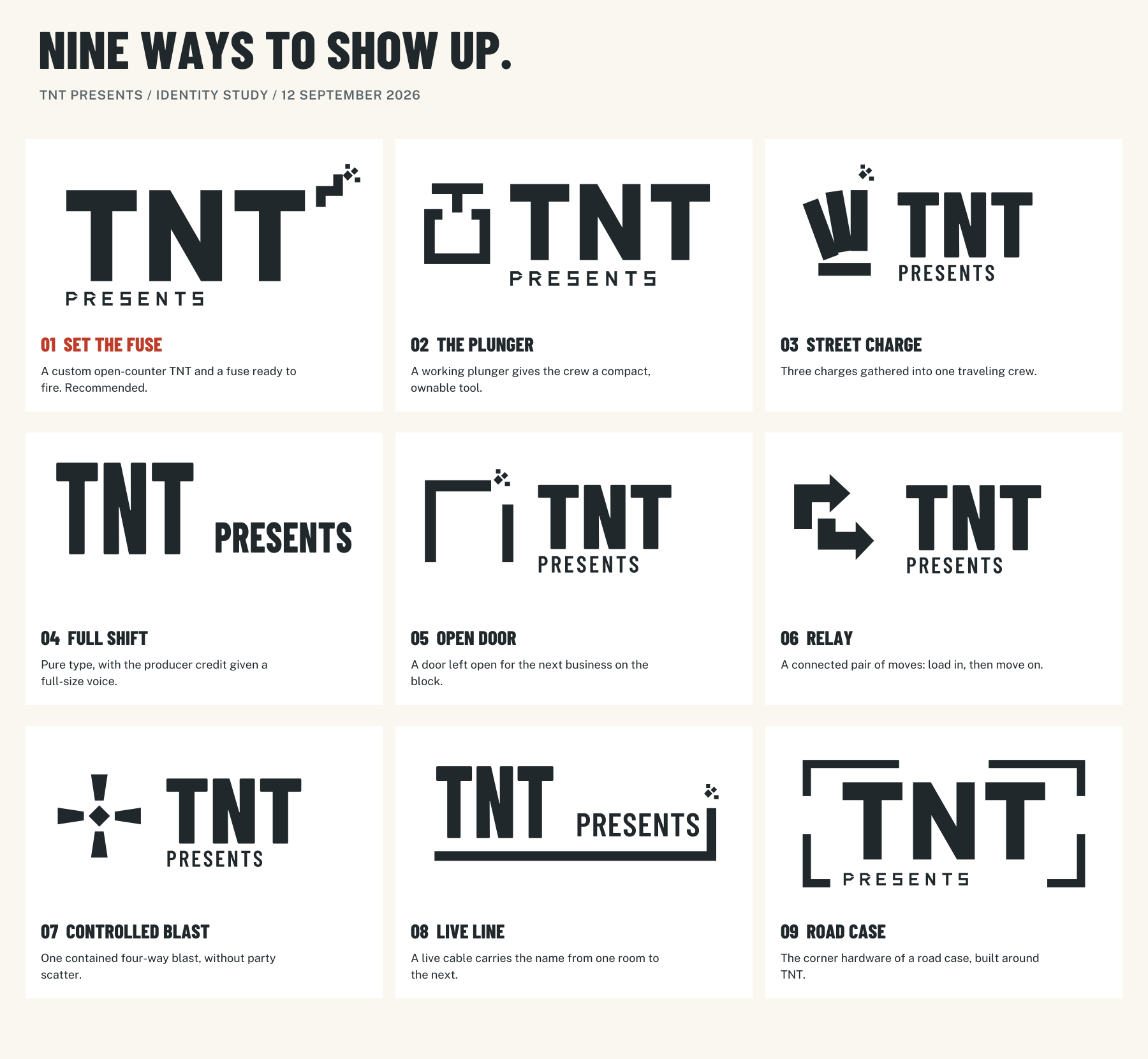
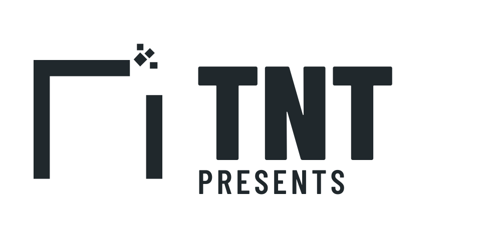
Each name below opens a standalone SVG with outlined lettering, a transparent background, an accessible title and no external font or image dependency. All are genuinely one-color artwork. 01 and 02 have open counters throughout and work as reusable stencil masks; 09 also uses that lettering. Ordinary cut vinyl with transfer tape can support the other directions’ enclosed letter counters.
The dimensions below are conservative starting specifications, not claims from a fabricated vinyl installation. “Width” means the entire supplied SVG artboard, including its built-in space. Screen reductions are included in the evidence. Keep extra clear space outside that artboard equal to one TNT stem width. Never redraw the name in the heading font.
| Direction / usable SVG | What it is doing | Window | Multi-logo board | Phone |
|---|---|---|---|---|
| 01 · Set the fuse | Broad custom TNT; the small fuse suggests energy under somebody’s control. | Best primary. Full lockup at 18 in or wider; open-counter stencil. | Use 10–12 in wide as producer credit, with generous neutral surroundings. | Full lockup at 320 px; TNT micro below 240 px; fuse icon from 48 px. |
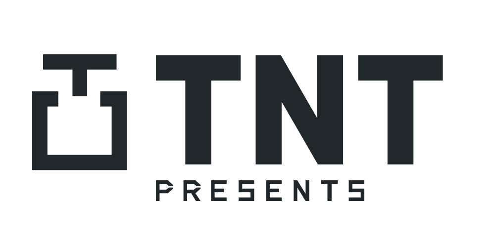
| 02 · The plunger | Mark plus wordmark; a tool somebody operates, with clear dynamite ancestry. | Full lockup at 18 in; open base and lettering avoid trapped stencil islands. | Compact tool holds at 10–12 in; less need for accent color. | Full lockup at 300 px; the tool alone needs about 48 px. |
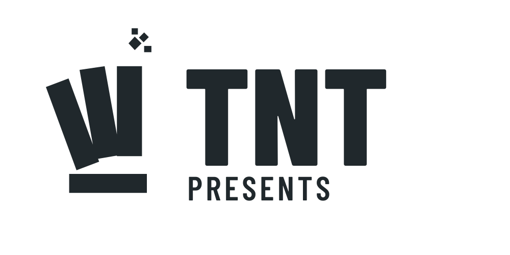
| 03 · Street charge | A bundled charge gives several moving pieces one common purpose. | Strong at 18 in; regular vinyl, not the preferred reusable stencil. | Use at 12 in; the tilted bundle makes a denser silhouette than 01. | Full lockup at 300 px. The three-piece bundle begins merging below 48 px. |
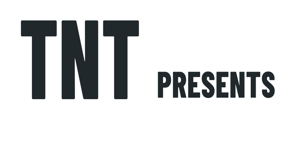
| 04 · Full shift | Pure wordmark; TNT has weight and Presents gets a substantial voice. | Calm and direct at 16 in; no pictogram to explain. | Best quiet option at 10–12 in when partner logos are especially busy. | Full name at 240 px. At avatar size, use TNT as a separate crop. |
| 05 · Open door | A doorway with a spark makes movement between businesses visible. | Recognizable open silhouette at 18 in; lettering uses normal vinyl counters. | Use 12 in; it implies a host but risks reading as property/services. | Full lockup at 300 px; icon at 48 px. Keep the spark at small sizes. |
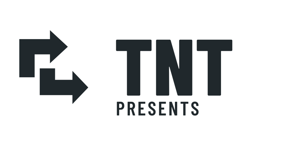
| 06 · Relay | Connected directional moves express the traveling crew. | Bold at 18 in. Better at a glance than in a literal dynamite reading. | Use 12 in. Has the strongest logistics-company risk; lower-ranked. | Full lockup at 300 px; arrows survive at 40 px. |
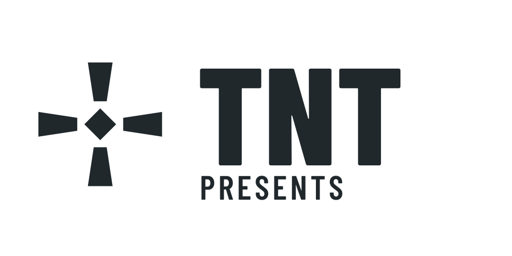
| 07 · Controlled blast | One contained four-way detonation honors Tony’s explosive idea. | Broad rays hold at 18 in; no decorative spray. | Use 12 in. More visual energy than 01; keep it entirely one color. | Full lockup at 300 px; blast icon at 40 px, without the descriptor. |
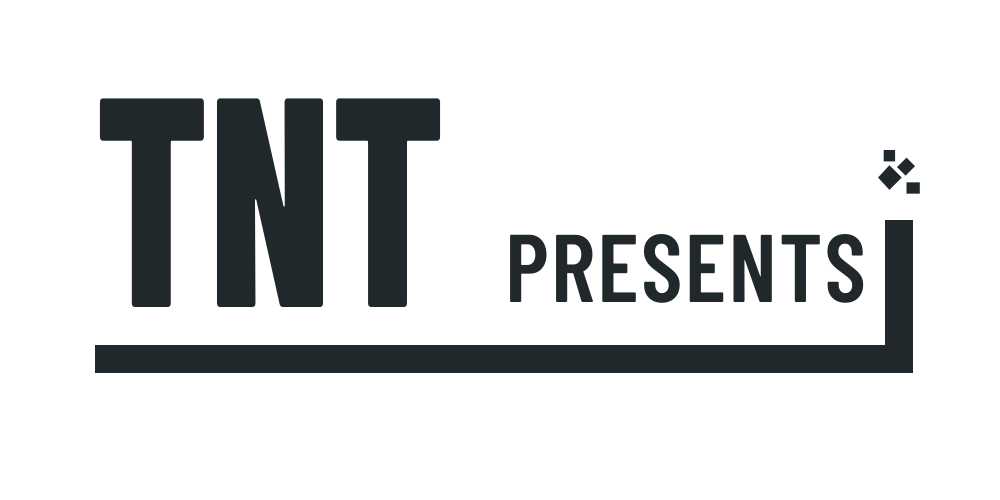
| 08 · Live line | One cable-like fuse unifies the name and carries it to the next room. | Horizontal orientation works well on a long pane; 20 in preferred. | Use 12–14 in. Needs width; avoid squeezing into a square sponsor cell. | Full name at 300 px. The long line is poorly suited to an avatar. |
| 09 · Road case | Open corner hardware suggests equipment in transit. | Open-counter stencil lettering at 18 in; the frame stays deliberately open. | Use 12 in. More enclosed presence than 01; useful on a truck or case. | Full lockup at 320 px; corners become unnecessary at micro sizes. |
Why 01 wins. It lets TNT be large when it is selling the crew and small when it is hosting the block. The name remains the first read; the fuse is a recognizable detail rather than another competing badge. A secondary fuse mark is supplied, but a brand-new company should lead with its name. The 32 px favicon should use the supplied TNT micro, not try to miniaturize “Presents.” The plunger is a close second: more literal, but the symbol needs explanation for people who have never seen one.
Stencil construction. The two Ts and N have no enclosed counters. In the custom PRESENTS lettering, P and R open at the outer bowl. At an 18 in primary artboard width the narrowest intended bridge is approximately 1.36 mm. Use transfer vinyl for very small lettering and ask the fabricator to confirm stock/cutter limits on the actual material. Only geometry was checked here; there was no physical cutting or glass test.

3. Color
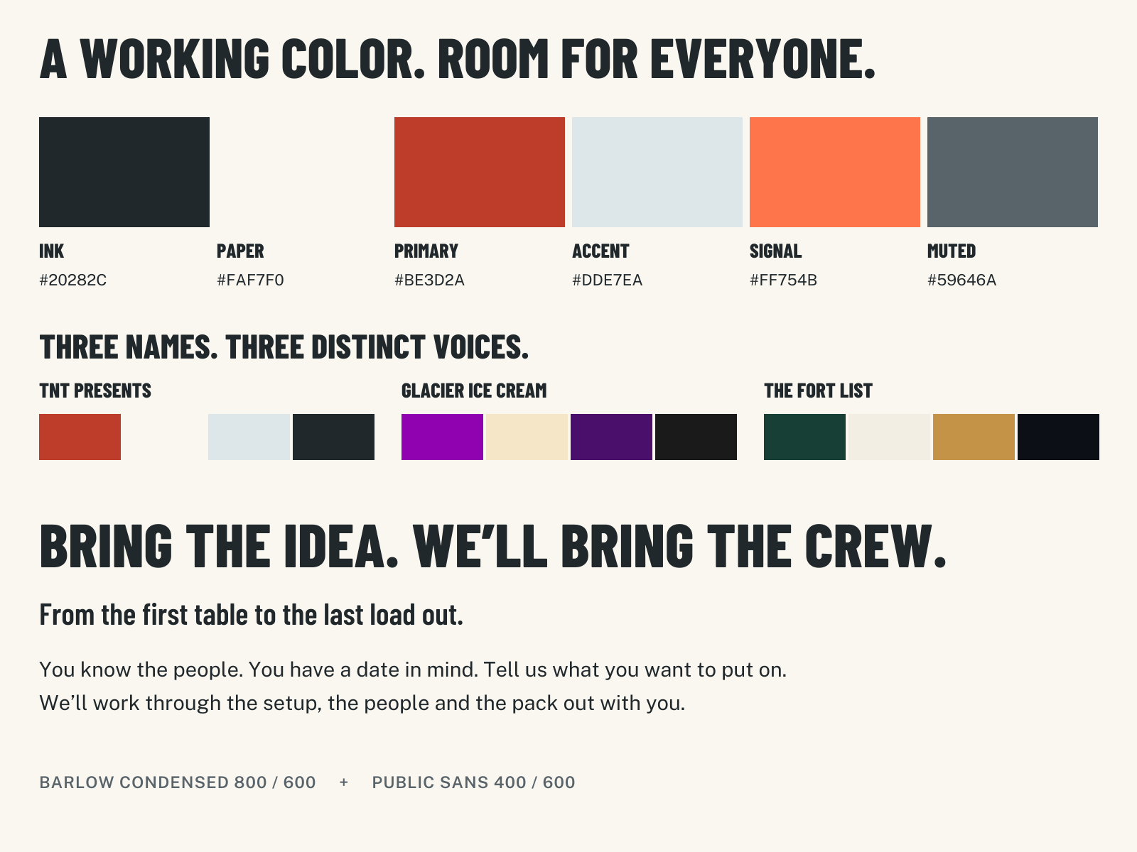
| Role | Hex | Use |
|---|---|---|
| Ink | #20282C | Logo, body copy, crew-shirt base, strong rules. A cool charcoal. |
| Paper | #FAF7F0 | Default reading and print surface. Clean warm paper, not brown kraft. |
| Primary | #BE3D2A | Vermilion identity hit, campaign fields, text links on paper. |
| Accent | #DDE7EA | Cool pale blue for a schedule strip or quiet secondary surface. |
| Signal | #FF754B | Small action marker, findable object or gift-card illustration. |
| Muted | #59646A | Secondary copy, captions and supporting labels on light surfaces. |
| Partner substrate | #FFFFFF | Neutral logo wells; a material accommodation, not a second brand primary. |
Against the neighbors. Glacier keeps its saturated purple and Playfair voice. Fort List keeps forest, aged gold and its ink/paper system. TNT takes vermilion and condensed working lettering. Its paper can sit alongside their light grounds because typography and the identifying hue carry the distinction. The adjacency specimen uses the supplied colors, not reconstructed official logos. Place all partner marks on their own neutral wells; do not recolor Glacier purple to TNT red, or give Fort List’s gold to TNT as another accent.
Hosting rule. On a partner board, reserve at least 85% of the surface for paper/white and the participating logos. TNT’s primary color occupies under 5% in the delivered board; signal orange is absent. Give every small-business mark the same maximum optical area and an inset of 18 units inside its 180 × 140 unit cell. Wide names will use width; round marks will use height. Equal box size alone is not equal prominence. The campaign poster can use a larger vermilion field because it has one event to announce; sponsor names still sit on paper. For routine pages, signal should generally occupy under 3% of the composition.
The complete intended text-pair list. WCAG sRGB relative-luminance formula, opaque flat colors, rounded to two decimals. All pairs meet the 4.5:1 normal-text AA threshold. Ratios are symmetric, but the approved role combinations are explicitly listed. Computation and unrounded-enough results are in contrast.json and build_identity.py. The threshold comes from W3C’s contrast minimum guidance.
| Text | Background | Contrast |
|---|---|---|
| Ink | Paper | 14.01:1 |
| Muted | Paper | 5.68:1 |
| Primary | Paper | 5.05:1 |
| Paper | Ink | 14.01:1 |
| Paper | Primary | 5.05:1 |
| Ink | Accent | 11.91:1 |
| Muted | Accent | 4.83:1 |
| Ink | Signal | 5.64:1 |
| Ink | Partner white | 14.99:1 |
| Muted | Partner white | 6.08:1 |
| Primary | Partner white | 5.40:1 |
Do not introduce other text combinations: in particular, no paper text on bright signal, no primary text on ink, and no muted text on primary. Separate text from illustrations and texture. A clear glass pane has no fixed background contrast: use the supplied dark vinyl on reliably light glass backgrounds or the reverse vinyl on reliably dark ones; if the view behind the pane varies, apply the design to a solid paper/ink panel. Actual glass, glare and production ink require a physical proof.
4. Type
Headings: Barlow Condensed 800. Subheads: Barlow Condensed 600. Body: Public Sans 400; emphasis and compact labels: Public Sans 600. Both are real downloadable, OFL-licensed web-font families in the official Barlow Condensed and Public Sans Google Fonts repositories. Local WOFF2 files, original TTFs and both licenses are included.
Barlow Condensed gives a six-foot poster a compact, readable shout. Public Sans keeps the explanation conversational. Short display lines can be uppercase; ordinary sentences stay in sentence case. No script, ultra-wide tracking in body text, fake typewriter register or technical labels masquerading as Tony’s voice.
WE’LL BRING THE CREW.
You know the people. You have a date in mind. Tell us what you want to put on. We’ll work through the setup, the people and the pack out with you.
Use 56/54 px heading, 28/32 px subhead and 18/28 px body on a phone; 96/90 px display, 36/42 px subhead and 20/30 px body on a larger page. Condensed type belongs in short lines, never long paragraphs. The vector specimen above shows the actual fonts even in a Markdown reader that does not load the live type sample.
--font-heading: "Barlow Condensed", "Arial Narrow", Arial, sans-serif;
--font-body: "Public Sans", system-ui, -apple-system, "Segoe UI", sans-serif;
5. Imagery
Working paper, open doors. Flat cut-paper constructions of doorways, road cases, folding tables, cables and the board itself. Broad silhouettes, a few deliberate diagonals, clean color separations and one intentional fuse. The permanent system shows preparation and connection. The event campaign adds a gift card and the invitation to dress up. No fabricated crowds or client-work photographs.
The illustrated doors on the finished poster are original SVG geometry, so the identity already has a usable image system without waiting for an image model. The image-generation extension is delivered as six complete standalone prompts: one hero, three section images, a poster background and a seamless texture. Each carries its own colors, composition, aspect ratio and negative constraints. Generated images are optional illustration, never event proof. The six prompts have now been run with the built-in image generator. The optimized illustrations are included in the downloadable brand kit and displayed on the live brand page.
Open all six ready-to-run image prompts
An imagery system without a fake portfolio
Working paper, open doors. Use graphic constructions of the things that make an event happen: a door, a case, a board, a folding table, a cable. Build them as plainly illustrated cut-paper objects with square cuts, a few deliberate diagonals, broad silhouettes and flat screenprint color. Show preparation, connection and pack out. Keep one continuous fuse line and, at most, one ignition point per composition. The fuse is a metaphor, never practical explosives imagery.
The permanent brand uses no pumpkins, alcohol, costumes or seasonal colors. Those belong to a named event campaign. Abstract spatial scenes avoid a falsely documented event, rented stock crowd or invented local architecture. Actual photos can replace these illustrations after TNT has actual work to show. Keep generated files in an internal manifest with illustrative: true, proofEligible: false, and descriptive alt text. A real event-photo caption must never be attached to these images.
All six prompts below are standalone. Generate without lettering; add the supplied vector logo and typeset copy afterward. Hex colors describe art direction; normalize final web surfaces to the exact palette separately. Generated pixel colors are not a reliable contrast reference. Avoid placing body text on texture or artwork.
1. Hero — The crew moves the idea
Create a 16:9 editorial cut-paper illustration for TNT Presents, a new neighborhood event production crew. On the right 55% of the frame, construct three freestanding open shop doorways at different heights, a single closed wheeled road case and an unbranded folded table. Connect these objects with one deliberate squared cable-like fuse route ending in a small three-piece geometric spark. They are illustrated stage objects in an abstract space, not a real location or a record of an event. Keep the left 40% as completely quiet warm paper for separately typeset words. Broad hand-cut silhouettes, restrained asymmetry, crisp screenprint edges, almost no shading. Palette: paper #FAF7F0, ink #20282C, vermilion #BE3D2A, cool pale blue #DDE7EA; one tiny orange #FF754B detail. Neighborly, capable, ready to work. Negative constraints: no photographs, people, crowds, real venues, skyline, mountains, text, letters, logos, fake signage, confetti, disco balls, balloons, cartoon bombs, fire, weapons, neon, gradients, cinematic fog, lens flare, glossy 3D, stock business metaphors or manufactured wear.
2. Section — Set it up
Create a 4:3 editorial cut-paper illustration of event setup as an abstract object study: one folded table, two trestle supports, a coiled cable and a closed road case arranged diagonally with enough space to understand how they fit. One vermilion strip joins the objects like a plan becoming a setup. View from slightly above, broad silhouettes and simple mechanically plausible shapes, flat screenprint separations on #FAF7F0 paper, ink #20282C, primary #BE3D2A and cool pale blue #DDE7EA. Keep the top quarter quiet. The composition should feel like somebody knows which piece comes next. Negative constraints: no photographs, hands, faces, crew uniforms, crowds, venue interiors, real client work, text, logos, checklists, tool-brand marks, balloons, confetti, party clip art, danger signs, explosives, glossy 3D, bevels, gradients or grunge overlays.
3. Section — Make room for the block
Create a 4:3 editorial cut-paper illustration of a large freestanding square community photo board, viewed almost straight on. Arrange twelve equal blank rectangular paper slips around its outer edges, with a generously empty central opening of visual space. Two simple sturdy feet show that someone installs and removes it. All slips are blank, with no invented partner identities. Add one short vermilion cable-like fuse along the base. Flat screenprint geometry, intentionally cut edges, paper #FAF7F0, ink #20282C, cool pale blue #DDE7EA, vermilion #BE3D2A limited to 5% of the image. Negative constraints: no photography, real business logos, readable text, pseudo-lettering, people posing, crowds, fake sponsor proof, badges, stock mockup watermarks, elaborate frames, confetti, balloons, neon, gradients, glossy 3D or distressed textures.
4. Section — Pack it out
Create a 4:3 editorial cut-paper illustration showing the satisfying end of a crew's job: two neatly closed wheeled road cases, a folded table standing on edge and a coiled cable with its end tucked in. Leave a large clear patch of paper where the setup has been removed. Low side-on view with a single ink ground line, no venue and no clock. Use simple block shapes, restrained diagonals and flat screenprint layers: paper #FAF7F0, ink #20282C, cool pale blue #DDE7EA and one vermilion #BE3D2A case strap. Warm and practical rather than heroic. Negative constraints: no people, photographs, actual trucks, real addresses, client marks, captions, logos, implied past event, trash, disaster aftermath, exhausted-worker stereotypes, explosions, safety stripes, tactical aesthetics, lens flare, neon, glossy 3D, gradients or stock imagery.
5. Poster background — The next door holds something
Create a 2:3 vertical cut-paper screenprint background for a neighborhood Halloween scavenger hunt. Leave the top 33% and bottom 35% entirely blank warm paper #FAF7F0 for separately typeset title, date and details. In the middle strip, use a flat vermilion #BE3D2A field containing three open geometric shop doors, ink #20282C door frames, pale blue #DDE7EA door planes and one small unlettered gift-card shape in orange #FF754B. A single squared paper-colored fuse connects the thresholds and ends in one compact angular spark. The mood is curiosity on a familiar block; it must welcome both families and adults without depicting either activity. Negative constraints: no photographs, people, actual shops, identifiable architecture, invented sponsor logos, text or numbers, QR codes, pumpkins with faces, ghosts, gore, skulls, witches, alcohol, nightclub lighting, children’s party clip art, confetti, cartoon bombs, fire, gradients, glossy 3D or fake print damage.
6. Texture — The useful sheet
Create a seamless square 2048 by 2048 paper texture. Warm uncoated off-white stock, base color near #FAF7F0, very fine irregular short fibers visible only at close range, tiny tonal variations no greater than about 3% luminance. Even diffuse light, no directional shadow, completely flat scan rather than a photographed object. It should look like clean material someone can print a working sign on, without communicating age or luxury. Negative constraints: no text, marks, logos, grain clumps, stains, folds, torn edges, visible deckle, coffee rings, yellow parchment, kraft brown, glitter, halftone dots, gradients, vignettes, borders, shadows, mockup perspective, conspicuous noise or watermarks. Opposite edges must tile invisibly.
6. The proof artifacts
Window sign — 24 × 18 inches
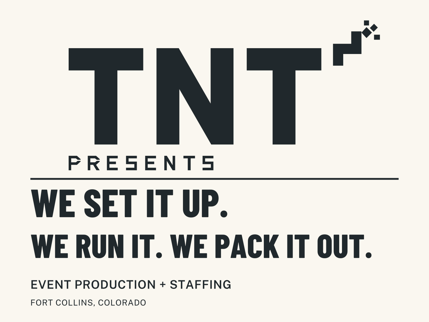
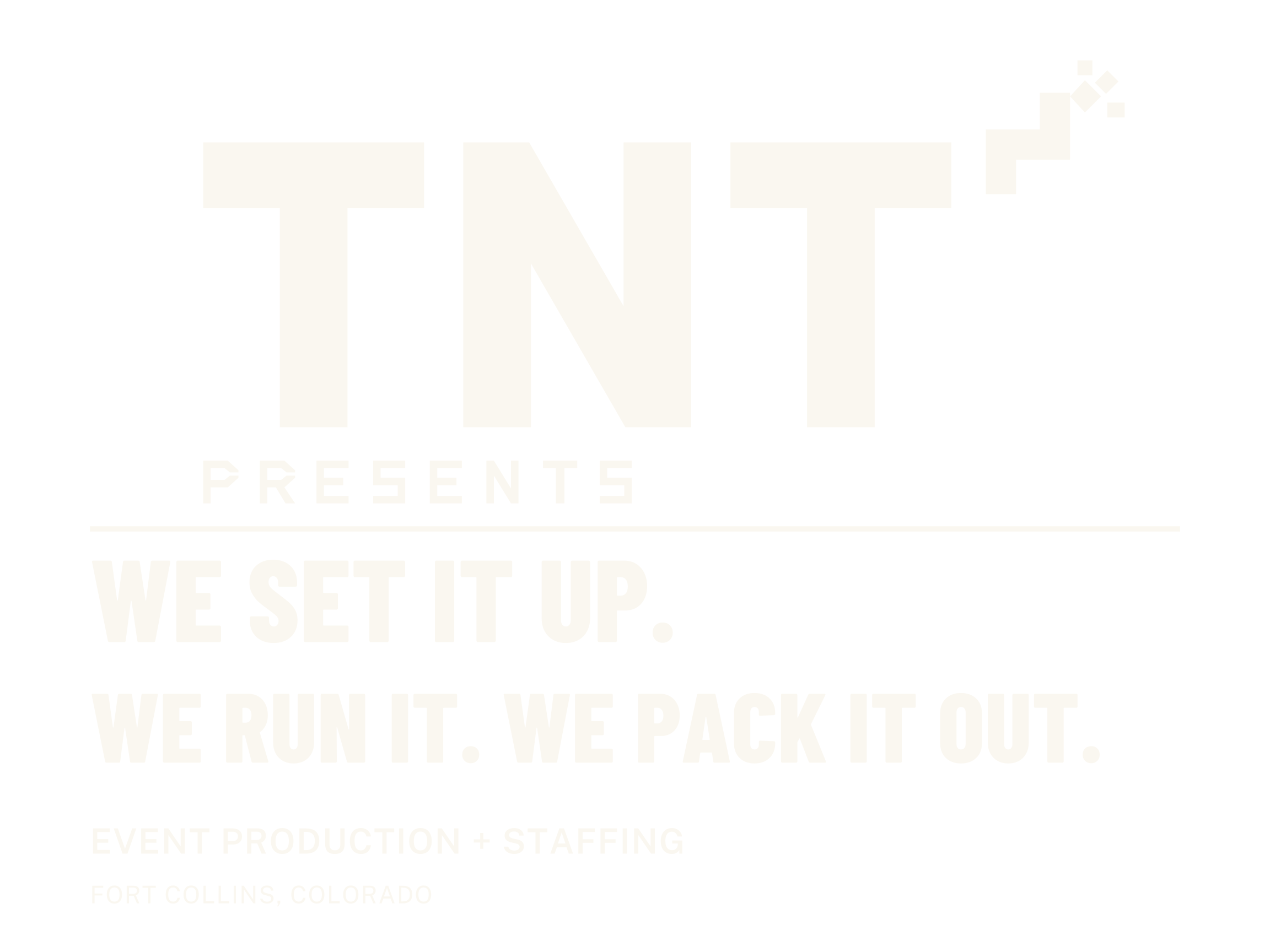
The name reads first; “We set it up. We run it. We pack it out.” tells the owner what TNT takes off their plate. The actual ink SVG is transparent and uses one fill color; the paper in this preview is a viewing surface. The delivered reverse uses one paper-colored vinyl. The main name is roughly 6.46 inches tall; supporting service text is roughly half an inch high. The logo is suitable for a stencil; the rest of the sign has ordinary type counters and is specified as transfer vinyl. No invented phone number or public email.
Partner/photo board — 96 × 96 inches
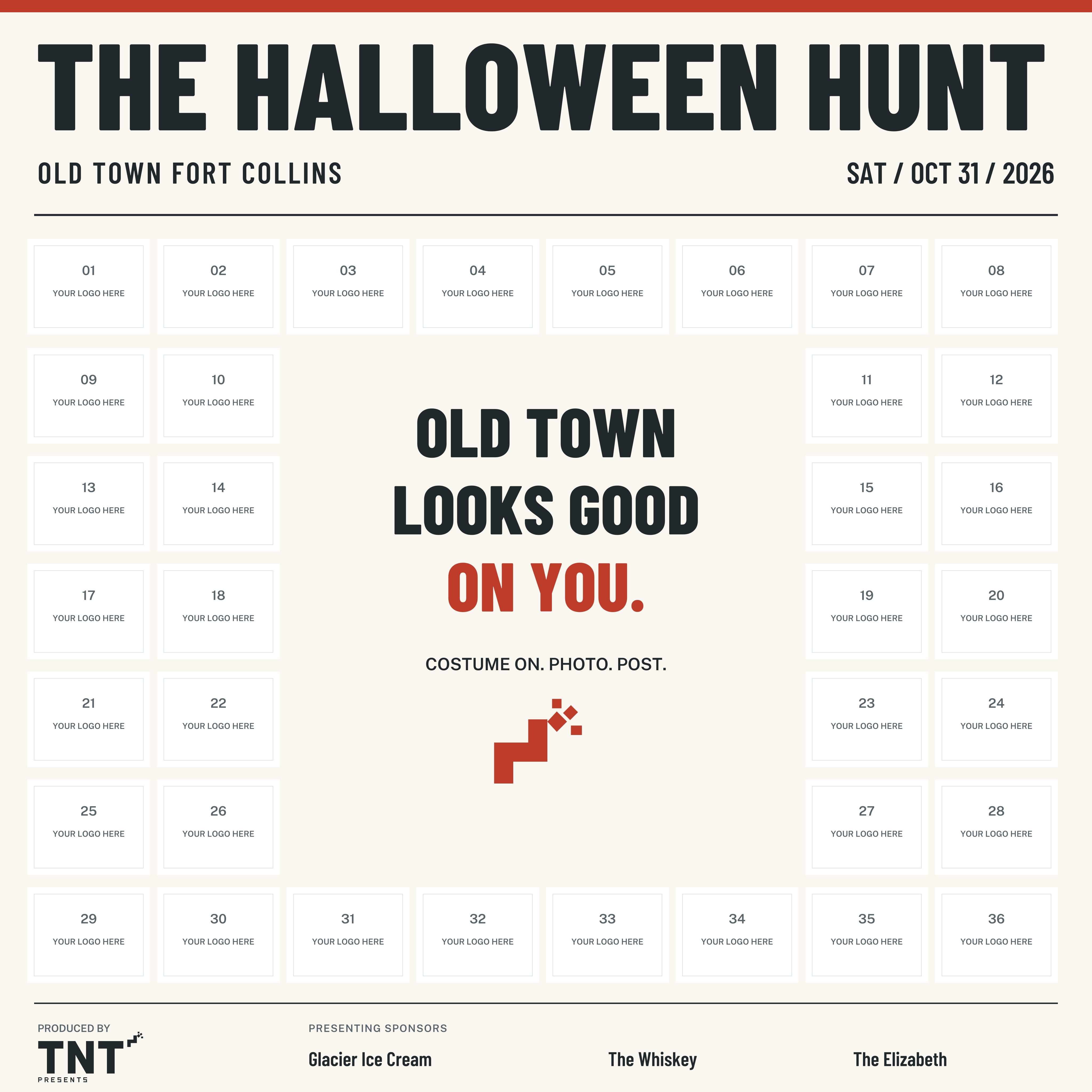
36 equal partner cells, each 10.8 × 8.4 inches, occupy the perimeter. The middle provides a 43.2 × 46.2 inch photo zone within the larger printed board; it is printed space, not a hole. The event title sits above heads. TNT gets a small producer credit; three presenting sponsors share a separate footer. A person will cover the central phrase in a photograph, which is intentional. Some partner marks may still be covered by arms or a group: repeat the same complete board at every business so every participant receives the same inventory. A physical pose test at the intended camera distance should determine stand-off distance and installation height.
The numbered “YOUR LOGO HERE” cells are explicit layout placeholders. Replace the entire contents of partner-01 through partner-36, leaving the well, and keep the safe insets. The sponsor names are typographic stand-ins, not fake official marks. Use approved files at comparable optical sizes. If fewer than 36 businesses join, redistribute occupied cells around the perimeter; do not print empty numbered boxes. If more than 36 join, enlarge/redesign the perimeter or agree a second board: do not quietly omit businesses or shrink every logo until it becomes unreadable. These cells specify capacity, not a claim that 36 businesses have signed up.
Halloween Hunt poster — 24 × 36 inches
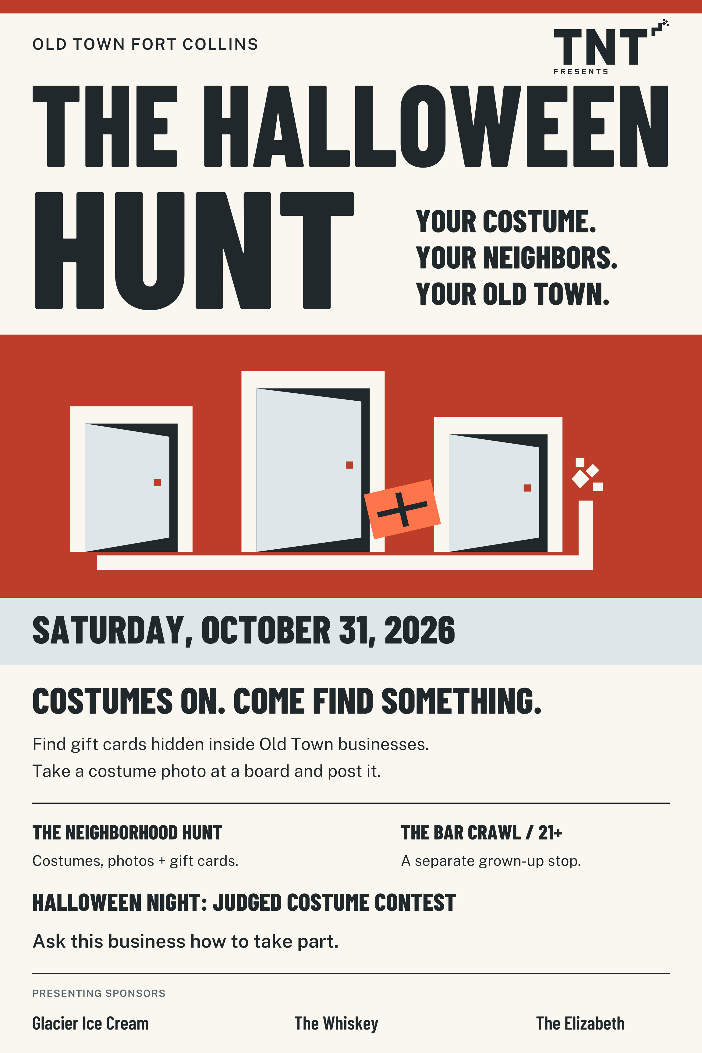
The six-foot read is Halloween Hunt → Saturday, October 31, 2026 → Old Town. The closer read explains gift cards, costume photos and the judged contest. The neighborhood hunt and the 21+ bar crawl are labeled separately on the same paper surface. Neither alcohol nor children becomes the visual identity. “Ask this business how to take part” is a shop-window action that works in a design proof without inventing a domain or a QR destination.
The background is original vector artwork: open doors connected by the fuse, with a small gift card. The red field is for this single-event poster; it does not carry through to the multi-logo board. On a phone, the title/date still read in the reduction, but the whole print poster is not a substitute for a responsive event-details page.
What the proof does and does not settle. The full six-week posting period belongs in campaign instructions once exact dates, posting destination and entry rules are set. The user’s contest mechanic gives each contributing business a judge’s seat; it belongs in the business recruitment sheet and judging instructions, not in the public poster’s six-foot headline. Final hunt/crawl/contest times, venues, contact route, age rules, participating list and official sponsor assets are still needed for publication. The supplied date really is a Saturday. These are designed, editable proofs, not release-approved event instructions.
Production handoff. Artboards carry true inch dimensions; all lettering is outlined and vectors can scale. Poster and board SVGs are at trim size in sRGB. The printer must add the bleed and board finishing allowance their process needs, convert against their actual output profile, and proof the vermilion on the chosen stock. Do not treat a generic CMYK conversion as a measured color match. Window SVG is a one-color cut master with no background. Pair the poster with an event-details card when sharing on a phone; retain explicit 21+ labeling wherever the crawl is offered.
7. Port sheet
Machine-readable JSON · All image prompts · Review evidence
ink: "#20282C"
paper: "#FAF7F0"
primary: "#BE3D2A"
accent: "#DDE7EA"
signal: "#FF754B"
muted: "#59646A"
partner_substrate: "#FFFFFF"
heading_font: Barlow Condensed
heading_weights: [600, 800]
body_font: Public Sans
body_weights: [400, 600]
heading_fallback: '"Barlow Condensed", "Arial Narrow", Arial, sans-serif'
body_fallback: '"Public Sans", system-ui, -apple-system, "Segoe UI", sans-serif'
recommended_direction: 01-set-the-fuse
logo_01: tnt-01-set-the-fuse.svg
logo_02: tnt-02-the-plunger.svg
logo_03: tnt-03-street-charge.svg
logo_04: tnt-04-full-shift.svg
logo_05: tnt-05-open-door.svg
logo_06: tnt-06-relay.svg
logo_07: tnt-07-controlled-blast.svg
logo_08: tnt-08-live-line.svg
logo_09: tnt-09-road-case.svg
primary_ink: tnt-primary-ink.svg
primary_reversed: tnt-primary-paper.svg
primary_color: tnt-primary-vermilion.svg
symbol_ink: tnt-mark-ink.svg
symbol_reversed: tnt-mark-paper.svg
micro: tnt-micro-ink.svg